Project Overview
The Product
Popcar is an app that lets drive-in moviegoers order food and drinks with ease. The items can be delivered to users' cars or get picked up at the snack bar. Menus are unique to the venue—but in this project I mainly focused on providing service to moviegoers at the Mansfield Drive-in Theatre & Marketplace. The app offers a comprehensive menu with accessible text features and search filters for food allergens or other dietary restrictions. Users can enjoy savings by entering promotional codes at checkout or signing up for discount programs. Users can manually enter in their payment information or use digital wallet integration for speedy and secure checkouts.
My Role & Responsibilities
I worked solo on this project, taking on the responsibilities of a UX Designer and UX Researcher. I drew sketches, designed wireframes, rigged prototypes, conducted user interviews and usability tests, synthesized data, and crafted this portfolio. I also illustrated icons and the Popcar logo.
Tools Used
For this project, I used: apps in the Google Workspace including Forms, Docs, Sheets and Slides; apps in the Adobe Creative Cloud including Illustrator, Photoshop and InDesign; the teleconferencing software Zoom; and the prototyping tool Figma.
An aerial view of the Mansfield Drive-In Theatre & Marketplace at night by Levin Aerial Works, LLC
Understanding the User
Qualitative Research & User Interviews
Utilizing my personal network, I reached out to two friends with characteristics that aligned well with my target users for interviews. They were sent a form I wrote that outlined my project, explained the purpose of these interviews, and asked for consent to record their sessions. During the interview, I asked open-ended questions from a script I wrote. I was mindful not to lead or pressure participants toward desired responses. Questions were kept short and simple with occasional follow-up questions to keep things conversational and get clarification as needed.
Some questions included: What kind of snacks do you enjoy while watching movies? What do you like or dislike about buying snacks at drive-in theaters? Who do you typically go to the movies with? How do you prefer to pay for movie tickets and snacks? What would make your concession stand experience better?
After the interviews, I reviewed the video recordings and transcribed the conversations. These helped me create empathy maps that outlined what participants said, thought, did, and felt. From there, I could craft personas and problem statements.
Personas & Problem Statements
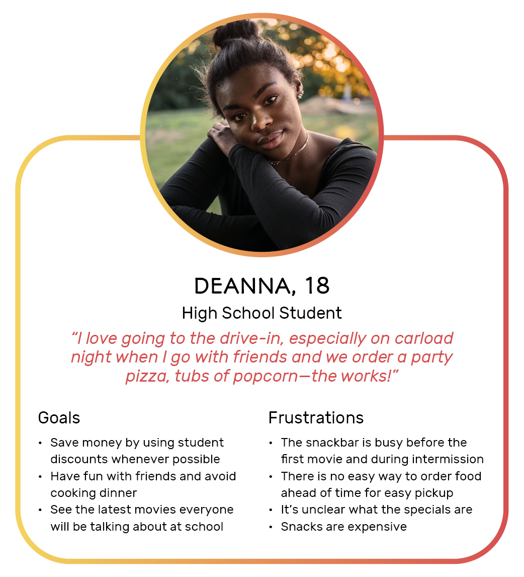
Deanna is a high school student with limited income who needs a quick way to place party orders for pickup because it is too overwhelming to place individual orders at the snack bar.
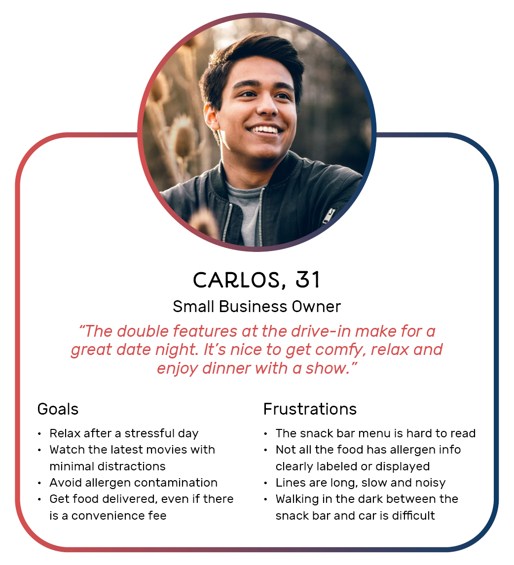
Carlos is a color-blind entrepreneur with dietary restrictions who needs a more legible way to order from the snack bar because buying the wrong food could lead to an allergic reaction.
Starting the Design
Paper Wireframes
I started out by drawing paper wireframes of four major screens: a welcome landing page, a profile page, a searchable menu, and an order review/confirmation page. I starred a few elements that I wanted to explore more in the digital wireframing stage.
Digital Wireframes & Low Fidelity Prototypes
Based on the starred elements in the paper wireframes, I began making digital wireframes in Figma. I kept these in grayscale and low-fidelity (lo-fi), using simple shapes and lines with minimal text. This enabled me to iterate designs more quickly without getting too hung up on the visual elements. I wanted to craft the basic structure a potential user flow: opening the app, navigating to the menu, filtering out items with allergens, adding items to an order for carside delivery, and checking out. This would form the basis for my first usability study.
Usability Study #1
Goals & Methodology
In July 2021, I conducted moderated and unmoderated usability studies remotely over Zoom. This was done in part to safely adhere with COVID-19 social distancing guidelines and to easily record the sessions from my desktop computer. I asked participants to interact with a lo-fi prototype on Figma and voice their thoughts aloud. Afterward, they were invited to answer a System Usability Scale (SUS) Questionnaire I created in Google Forms. Participants were asked to rate statements on a 1-5 scale (Strongly Disagree to Strongly Agree) or 1-10 scale (Very Unlikely to Very Likely), where appropriate. Answers were kept anonymous, encouraging participants to provide open and honest feedback. The overall goal of this study was to better understand the types of app features users expect and enjoy, which ones they dislike and avoid using, and how to better streamline the overall food-ordering process.
Participant Details
Five people participated in the study—three identified as men and two identified as women—between the ages of 18-35. Two participants were students with part-time jobs while the rest were fully employed. One participant had a Master's degree, three participants had a Bachelor's degree, and one participant had a high school diploma as their highest levels of education. All participants were residents of the United States and identified themselves as active smartphone users. All participants were familiar with the concept of drive-in movie venues and had access to vehicles for personal use. One participant had a severe food allergy that restricts their diet.
Prompt 1: From the welcome screen, find the searchable menu screen. How easy or difficult was it to complete this task? What would you change about this process?
Prompt 2: Add a peanut-free item to your cart. How easy or difficult was it to complete this task? What would you change about this process?
Prompt 3: Place an order to be delivered to your car. How easy or difficult was it to complete this task? What would you change about this process?
Research Insights & Recommendations
Insight 1: Some users will not use an app if they are required to create an account. Recommendations: Do not front-load the app with a welcome screen that forces users to choose between “continuing as a guest” or “creating an account.” The app should be accessible as a guest with the option to create an account later—if at all.
Insight 2: The menu screens and food items need better visual cues, especially when adding items to an order. Recommendations: Label the navigation better so users can follow their happy path with the least resistance. Button interactivity should also be more clear with better motions or haptic feedback where appropriate.
Insight 3: Some users rely on discounts while other users want to add additional funds like tips for their carhop servers. Recommendations: Make it possible for users to enter promotional codes or join discount programs for students, military personnel, seniors, teachers, medical staff, etc. Since tipping is still a common practice in the United States, some users want the ability to add tips during checkout.
Insight 4: Users need more flexible payment options. Recommendations: Make it possible for users to use different types of payment at checkout by integrating with digital wallets, third-party payment apps, and gift cards. 63 million Americans are “unbanked” or “underbanked,” meaning they do not have easy access to financial institutions or carry traditional forms of payment like debit or credit cards.
Design Revisions
The Welcome Screen
The welcome screen was removed. The menu screen now acts as the landing page when users open the app. If users would like to create an account or log in, they can do so from the appropriate icon at the top.
The Searchable Menu
Filter tags can be toggled to appear or disappear under the search bar. The "add item” buttons were enlarged to be more apparent. There will be a micro animation to visually cue when an item successfully gets added to the cart.
The Checkout Process
More tabs with payment options—like Venmo, Cash App, Google Wallet and Apple Pay—have been added to the checkout area. Payment information fields have been labeled more clearly with improved micro copy. Text fields for promo codes and tips were also added to the checkout process.
Refining the Design
🚧 High-fidelity prototypes are still being worked on and will undergo a second round of usability testing. In the meantime, please enjoy this partial Figma prototype and a sneak peek at the Popcar branding. I created the logo mark in Adobe Illustrator, taking inspiration from classic popcorn tubs.


